The Utilitarian Web
by Leo Robert Klein
[The following is a preprint copy of an article which eventually
appeared under the title "The Web Is Not Your Library" in the Winter
2001 edition of 'Library Journal's netConnect Supplement.]
Creating a library web site is a lot like putting together a meal : you want
to impress your guests with an abundance of dishes but you don't want to so
overwhelm them that they can't find what they want. Settling the question then
of what gets served up and when is crucial to designing an effective library
Web site.
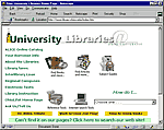
University of Ohio. Is this utilitarian? The answer depends on whether the
site is set up to accommodate most of its likely users. With links to books
and articles on the home page together with other helpful services, the
answer has to be yes. Go
to site [courtesy of the wayback machine]. |
Of course things would be far easier if there just weren't so much to put up.
Unfortunately, we're not likely to get hit by a dearth of material any time
soon. On the contrary, material is coming in by the truck-load. What's more,
this material is often coming with some very definite handling instructions
("can you make that white text on black background, please"). There
may even be a notion or two -- arrangement of material going with the territory
-- of how exactly to arrange this stuff on the web page ("this is so important,
it's got to go on the home page -- and make sure it blinks").
Of course not all suggestions are frivolous. Also, it shouldn't be surprising
that people who've invested a significant amount of time into something will
continue to take a proprietary interest in it even after it's left their hands.
The question for the library Web developer is how to meld all of these conflicting
interests into something the end-user can actually use.
Kitchen Sink
One option is simply to put everything up at once. The advantages are many:
nobody's feelings are hurt, the priorities of every constituency are sure to
be met. The home page, it is true, will look somewhat cluttered but what do
you expect with everything the library does wedged into a screen 640 by 480
wide?
And sure this sounds extreme but people have given it their best shot. Mission
statements on a library's homepage are a sure sign; Links to a Zip Code directory
or to BIP are another. Portals are popular; so too are arrangements based on
type of resource and type of user. Deciding on one of these or the other can
be a painful, gut-wrenching experience. To avoid unpleasantness and to make
everyone happy, why not just lump them all together and let the user decide
-- since apparently we are unable to do so -- just what exactly we're trying
to do.
The problem with this scenario is that we're abrogating any responsibility
to actually select and arrange our material. Not only would the site come off
as suffering from a personality disorder but users might find it extremely confusing
and difficult to use.
An Institutional Approach
Another favorite is the organizational route -- that is, to take the organizational
structure of the institution and simply transfer it to the web. This one is
bound to be popular especially with department heads who'll be able to find
their sections without too much trouble. There'll be a section on Collections,
ILL, Reference. There'll be a book catalog and a Serials section. Reserve will
be in there too. It'll be just like walking into the library itself.
As powerful as this concept sounds, it suffers from a number of problems. First,
a user accessing our site is not the same as a user stepping into our institution.
The navigation in the physical plant, just to take one example, consists of
helpful people placed here and there directing the user to the appropriate section
of the library. Admittedly a dream solution in any circumstance (even online),
heads are not likely to be popping out of monitors offering critical advice
to users any time soon. For much of their time online, users are going to be
on their own.
A sobering thought. There's no guarantee, given this kind of environment, that
the distinctions we are most comfortable with as to department and service are
going to do anything other than bounce off average users. The way it looks to
them, we might as well be arranging our site by floor and room number.
Online Signage
With users in the driving seat for much of their online experience, there have
to be indications along the way presented in terms they're likely to understand.
To throw words at them like "gateway", "resources", or even
the far more specific "databases", is fine provided everyone agrees
on what these things mean.
Say, our proverbial user has a term paper to do. He or she comes to our site
looking for an article or two and quite understandably, goes fishing for something
that looks like "article" somewhere on the home page. In many cases,
they are going to be disappointed. They are going to be disappointed because
what they're looking for is lurking behind the expression "online resources"
or "databases". After a little work, they may indeed figure this out
but whether successful or not, they'll probably come away wondering why something
so seemingly concrete as "article" should be wrapped in such mystery.
The same goes for books.
Say, our user next wants to renew a book. While he or she is busily hunting
around for the word "renewal", we at the other end of the information
superhighway are busily sticking the thing on a page called "circulation".
It's cat and mouse.
Why not take that renewal form and list it together with all the other forms
the library has online? Okay, so this would be something of a mess if we did
it in the bricks-and-mortar world -- something like tax-forms at the Post Office
the closer we get to April 15th -- but online it makes sense. All the forms
go in one place and we put a link to them somewhere prominently on the home
page. People then have a meaningful place to go based on the knowledge not of
the library department involved but simply on the fact that they need a 'form'.
The point then is to increase the transparency of our resources. We can do
this by speaking in the same language as our users and by making the access
and arrangement of our materials as simple and intuitive as possible. The things
we have on offer like articles and books should be advertised as articles and
books. We shouldn't have to go looking for some other expression when the thing
itself will do. In fact, this is always preferable -- that is, expressing the
thing over the concept and the simple concept over the complicated or convoluted
one.
Know Thy Customer
Of course, we don't want to dumb down our material either. No one appreciates
being treated like a 5-year old after all. To avoid this we have to get a handle
on exactly who our users are and what they want from us. In many institutions
which serve a mixed population, this isn't always the easiest thing to do but
we need to come to some resolution if only in broad terms as to what people
are looking for when they visit us or it'll be hard to give any coherence to
our online presence.
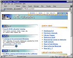
The clean lines and simplicity of the San Diego site still have everything
a student could ask for. Go to site. |
An obvious place to start is to round up a group of users and ask. This is
so simple you'd think everyone did it and yet, on occasions, there are sites
out there whose source of inspiration is anything but user-based. This oversight
seems due to the fact that the earliest sites were little more than brochureware.
They combined online versions of various pathfinders with links to a handful
of resources. There was no need for great amounts of input from end-users because
these earliest sites were by their nature pilot projects.
For most of us, this no longer is the case. To provide a service that our users
are going to make the most of, we have to go out there and ask them. We can
ask them while they're walking in the door; we can ask them while they're sitting
in front of a public terminal; we can ask them online through online surveys
posted on the site. In addition to this, we can have a look at the kind of traffic
our site is already getting in terms of hits and page views.
What we're trying to build, again, is an overall picture of exactly what resources
are most popular, who's using what, etc. This way, we'll be standing on far
firmer ground when we come to organize our site than the anecdote and intuition
of days gone by.
The Utilitarian Web
Of course, the library may have a priority or two up its sleeve which may not
show up on the survey form or be first on the lips of the interviewee. Services
like instructional workshops or electronic reserves which users may be unaware
of but which nonetheless represent a significant investment on the part of the
library, for this reason alone, warrant a prominent piece of screen real estate.
The purpose of the Utilitarian Web isn't to wipe these things off the face
of the library's home page. Rather the purpose is to provide ourselves with
a rule of thumb when negotiating a tangled web of conflicting priorities so
that in the end we come up with the half dozen or so things that we have to
get right sine qua non. Coming up with these things however is not simply
a matter of plugging in the numbers. It depends as much on our experience and
professional judgement as librarians as on user surveys and the like. The Utilitarian
Web isn't the Inflexible Web after all.
It also isn't the Puritanical Web. In fact, it can be as cheerful or as cheerless,
as visually stimulating or as visually-challenged as we want to make it. The
concept itself says nothing about how our site should appear visually one way
or the other.
Nothing as complicated as a library web site is going to satisfy all users.
The site isn't going to do away with questions at the reference desk or lighten
the workload of any department. It isn't going to make anyone's life easier
-- except maybe for the user. If there were a guaranteed method of building
the perfect site following a certain number of steps, it would have been patented
long before now. Methods, quite naturally, tend to differ according to our understanding
of local conditions and needs. But regardless of the method we use, the outcome
in some way ought to reflect what most of our users are most likely to need
most of the time -- in terms they can understand.
This then is the Utilitarian Web in a nutshell. It's no more complicated than
that. Such an approach would seem obvious, self-evident, something everyone
ought to be doing and yet, clearly this isn't always the case. For the most
part however, we're all making efforts in the same direction even if some are
a bit farther along than others.